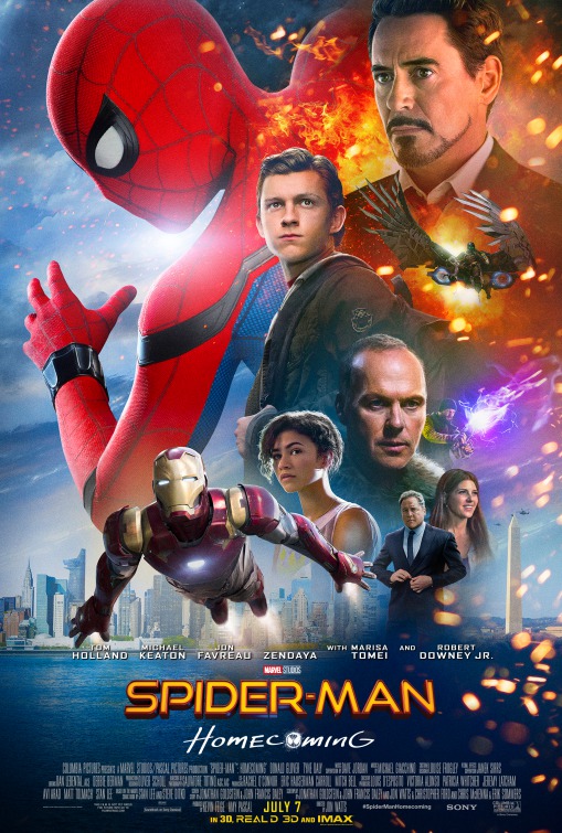
Rothman explained that the title Homecoming has a high school ring to it, but also as Holland said,”Peter (Parker) is trying to find his way home.” Rothman gave a shout out to former Sony motion picture group chair Amy Pascal, who is producing the film.
In addition, Holland introduced footage where Parker enters his home to find Aunt May with Tony Stark (Robert Downey Jr.). Stark tells Parker that he has applied for a special grant, and that he has been accepted. This is all news to Parker. The clip was capped off by the scene where Spidey makes his cameo in the upcoming Captain America: Civil War, which Disney is actually showing to exhibitors and CinemaCon attendees tomorrow.
I gotta be honest - after the Sam Raimi films I completely lost interest in anything related to Spider-Man. I was so turned off by another origins story that I pretty much rejected the reboot and never bothered to see any of the newer films.
-too many colors. Purple, orange, brown, red, blue? Settle on a color scheme!
-where is the focal point? Iron Man? RDJr? Spidey? The odd washington monument in the corner?
-why is Jon Favreau getting dressed?
-too many lens flares and blurry edges. Where is the light source coming from? Michael Keaton has a shadow on the same side as the girl has a highlight. Annoying.
-pick a font or two...not a different font for each item of text
-Marisa Tomei is way too happy about the monument. Everyone else is serious.
I'm sure this is a case of "Towering Inferno" syndrome, where RDJr has his head so big contractually.
Why not hire a comic book cover artist to do the poster? I'm sure Alex Ross would be willing.
I just don't understand how Iron Man's butler gets 3rd billing in a Spider-Man movie.
It is a terrible campaign. It's like most posters nowadays, especially Disney's Marvel ones, which are all set up like that in a "collage" format...the art of the movie poster has long past. And Marvel's posters are almost always terrible: